Fall-winter color trends: the latest trends in packaging

Come creiamo le vetrine

Color is a determining factor both in fashion as well as in the jewelry industry. Each year classic hues are joined by newcomers that make for interesting and fresh trends.

Color plays a fundamental role in jewelry packaging: it goes hand in hand with the brand identity and it helps making the suspense prior to opening the gift even more perfect. What are the signature colors for the next fall-winter season? Which trends will we select for our designs?

Jewelry packaging: how to enhance a precious gift

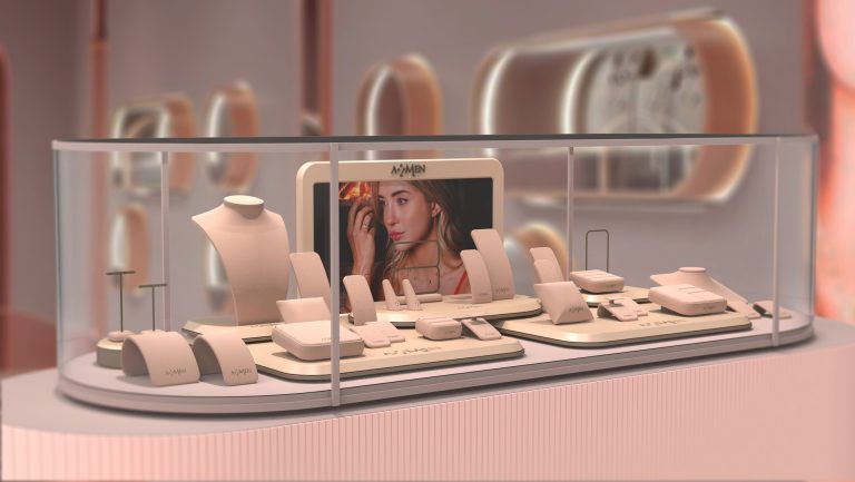
Before diving into the topic of colors, it is worth reminding that packaging plays an important role in the jewelry sector. We at SDJ Packing design cases, pouches and shoppers that are able to enhance jewels, while telling the brand story and values at the same time.

Each collection has a unique style, thanks to a tailored design and to the selection of materials, lines and colors that are perfectly consistent with the brand identity.

From simple boxes to the pouch 4.0., we always pay the greatest attention to our packaging design which must be not only beautiful and functional, but also perfectly aligned with the brand’s features. In order to do so, we must take into account colors and their role.

jewelry packaging

Color psychology, a marketing resource

jewelry packaging

Choosing colors is a very important process for brands of all sectors, ranging from fashion, through interior design and motor vehicle, to make up.

Color psychology is applied for a wide range of marketing purposes by all companies, and it is a major tool: color truly is a kind of language.

Colors stimulate the human mind, evoking feelings. Each color arouses specific emotions and mental associations that affect our choices in an unconscious and instinctive way.

Therefore, it goes without saying that choosing a specific color for jewelry packaging rather than another one drastically changes the impact that our product has on our clients, as well as the message we convey.

Timeless colors for men’s and women’s collections

Some hues go far beyond the yearly trends. We are talking about those timeless colors that never go out of fashion, such as powder pink, dove grey and ivory white for women’s collections and ultramarine blue, teal and anthracite grey for men’s collections.

Usually in the case of women’s collections, matte, bright, pastel and soft colors are preferred, that is no particularly warm or cold color tones which are more suitable for collections with a much younger target.

For men’s collections, dark and cold hues are usually selected, which inspire trust and calm and convey a sense of safety, stability and strength.

That’s where the main distinction in the color palette lies: on one side, we have those colors that are considered more feminine, while on the other side there are colors that are more suitable for men’s collections. The main difference in the use of colors lies here, rather than in the distinction between classic and modern which is conveyed by using specific materials or choosing specific lines.

jewelry packaging

New trends

jewelry packaging

Besides those timeless colors, new trends arise every season and a company that wants to keep up to date has to follow the latest trends.

The market itself asks for a continuous update of color trends and it is up to the jewelry packaging experts to analyze new trends and interpret color moods for the brands to use.

And what’s new in the world of colors? In the catwalks in Paris, New York, London and Milan vibrant and bright colors prevailed, once and for all leaving behind the belief that vibrant hues are only suitable for the summer season.

Amethyst purple

Amethyst purple is once again the signature color for the fall-winter fashion season. This hue is ideal for jewelry packaging, since it conveys a sense of aristocracy and luxury. It pairs perfectly well with gold and silver and it enhances diamonds in a unique way.

jewelry packaging
jewelry packaging

Emerald green

The color green is tied to strength and female elegance. Even though it is not easy to interpret, it can be combined in unexpected and surprising ways.

Whether it be used for boxes, pouches or shoppers, the result will surely be impressive. It has radically different effects, depending on which material it is paired with: a soft emerald-green velvet reminds us of wealth and historical lavishness, whereas an emerald-green leatherette with aged effect suits a young and modern line.

Ruby red

Ruby red is another color that won’t go unnoticed. When using this color for new pieces, one must carefully analyze the designs, in order to create display stands that are elegant, but not too flashy. As a matter of fact, we should always remember that jewelry packaging must accompany and enhance the jewel, and not overshadow it. 

Since it is the color of love and passion, it is obviously not suitable for bridal or kids lines. However, it could add a nice touch to very precious jewels, making the gift even more meaningful.

jewelry packaging

As far as jewelry packaging goes, colors are as important as design and the material selection. Colors “talk” and convey different emotions: being able to use them properly is fundamental to communicate with one’s target audience in the best possible way.